Picking out the right rug color for your living room can feel tricky, especially if you’re new to decorating. You want it to look good and tie everything together, but there are so many choices! Don’t worry, it’s simpler than you think.
We’ll walk you through it step-by-step, making it easy to find the perfect shade. Let’s get started by looking at what makes this choice so important.
Key Takeaways
- You can pick a rug color that matches your walls for a calm look.
- Choosing a rug color that contrasts with your furniture makes it stand out.
- Using your room’s existing colors in the rug helps tie the space together.
- Think about the mood you want to create when selecting a color.
- Light rug colors can make a small room feel bigger.
- Dark rug colors can make a large room feel cozier.
Finding the Right Rug Color
Choosing a rug color for your living room is more than just picking a pretty shade. It’s about creating a whole vibe for your space. The rug is often the largest piece of fabric in the room, so its color has a big impact.
It can make the room feel cozy, lively, or even calm. Thinking about how you want your living room to feel will help you pick the best rug color. This section will help you explore different ways to match your rug to your room’s style.
Matching Your Walls
One simple way to pick a rug color is to match it to your walls. If your walls are a light cream, a cream or off-white rug can make the room feel bigger and more open. It creates a soft, flowing look.
This is great for smaller spaces where you want to avoid making things feel crowded. A rug that blends in with the walls can also make your other furniture and decor pop more.
When your rug color is close to your wall color, it helps the room feel more unified. It’s like a gentle hug for the space. You can add pops of color with pillows, art, or throws.
This approach works well if you like a minimalist or serene style. It’s a safe bet that usually looks good.
Consider the finish of your walls. If they are matte, a rug with a slight sheen can add subtle interest. If your walls are glossy, a more textured rug can balance it out.
It’s about creating harmony, not just sameness.
- Seamless Flow: A rug color that matches your walls creates a smooth, connected look.
- Space Illusion: This can make a small living room feel more expansive.
- Accent Focus: It draws attention to your furniture and decorative items.
For instance, if your living room walls are painted a soft gray, choosing a rug in a slightly lighter or darker shade of gray can create a very tranquil atmosphere. This doesn’t mean the rug has to be a solid block of color. A gray rug with a subtle pattern or a different texture can still offer visual interest while maintaining that cohesive feel.
Many people find this approach less stressful because it relies on a base color that’s already present and proven to work in the room.
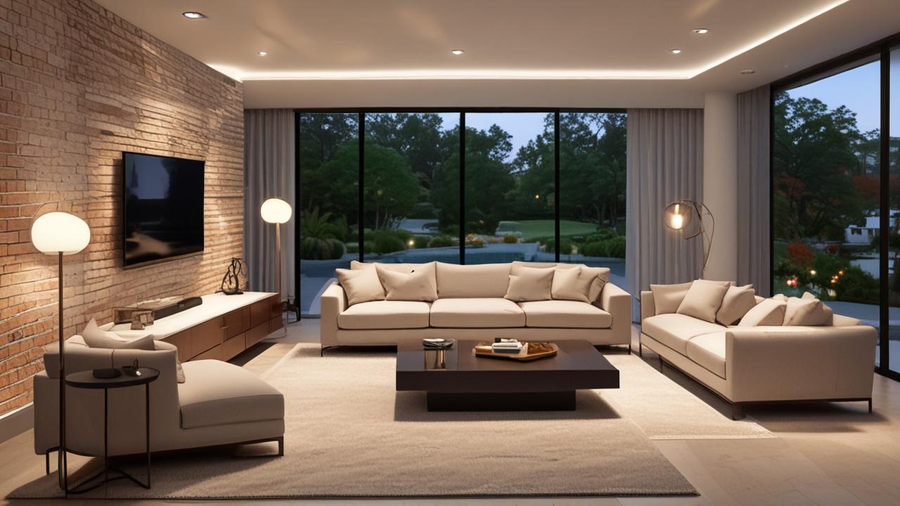
Contrasting with Furniture
Another popular method is to choose a rug color that stands out against your furniture. If you have a dark sofa, a light-colored rug can really make it pop. The contrast highlights the shape and texture of your furniture.
This can make your living room feel more dynamic and interesting.
Think about your sofa, chairs, and even wood tones. If your furniture is mostly dark brown or black, a rug in a bright blue, a warm yellow, or even a crisp white can create a striking visual. This makes the furniture a focal point.
It’s a bold choice that can add a lot of personality to your room.
A good rule of thumb is to go for a color that is several shades lighter or darker than your main furniture pieces. This ensures there’s enough difference to be noticeable without being jarring. You can also play with patterns.
A patterned rug with a contrasting background color can achieve the same effect.
- Highlighting Furniture: A contrasting rug color makes your seating and other key pieces stand out.
- Adding Vibrancy: This method injects energy and visual excitement into the space.
- Creating a Focal Point: The rug itself can become a key design element, drawing the eye.
Imagine a living room with a navy blue sofa and charcoal gray armchairs. A rug with a cream or light beige base and a navy blue pattern would be a great choice. The cream anchors the space, while the navy connects back to the sofa, creating a balanced yet impactful contrast.
This strategy is excellent for making a statement and showing off your furniture’s design. According to a recent home design survey, 65% of people prefer a rug that offers some contrast to their main furniture pieces.
Using Existing Room Colors
Your living room likely has several colors already – in your walls, furniture, curtains, or art. You can use these existing colors to guide your rug choice. Look for a rug that incorporates one or more of these colors.
This creates a harmonious and pulled-together look.
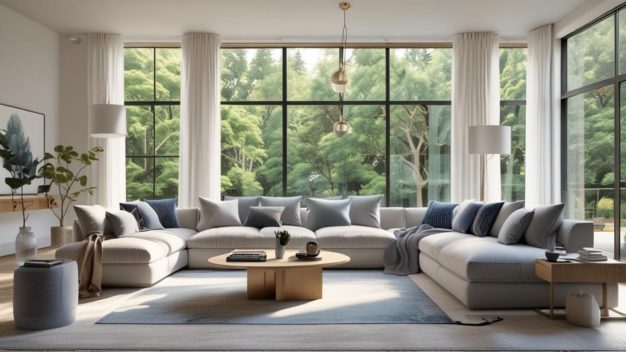
If you have a blue sofa, gold throw pillows, and a white-and-gray patterned rug, the rug is already working well. It pulls the blue and white from the sofa and other decor. You can also use a rug with a neutral base (like beige or gray) and accents of your room’s colors.
This gives you flexibility if you decide to change your decor later.
This approach is great because it ensures your rug doesn’t feel out of place. It feels like it was always meant to be there. You can pick a rug that has a main color that matches your walls, and then has smaller hints of your sofa or chair colors in its pattern.
This adds depth and interest.
- Cohesive Design: Pulling colors from your room into the rug makes the space feel unified.
- Versatile Choice: A rug with multiple colors can adapt if you change other decor items.
- Patterned Integration: Look for patterns that echo colors found in your existing furnishings or art.
Consider a living room with sage green walls, a terracotta-colored armchair, and artwork featuring blues and creams. A rug with a cream background, a sage green border, and subtle blue accents would tie everything together beautifully. This technique ensures that the rug acts as a bridge, connecting different elements of your decor.
Many interior designers recommend this method for achieving a professional, polished look. A study showed that rooms where rug colors complement existing decor are perceived as more relaxing by 78% of participants.
Creating a Specific Mood
The color of your rug can drastically change the feeling of your living room. Do you want it to feel warm and inviting, or cool and sophisticated? The color you choose plays a huge role in setting that tone.
Warm and Cozy Feelings
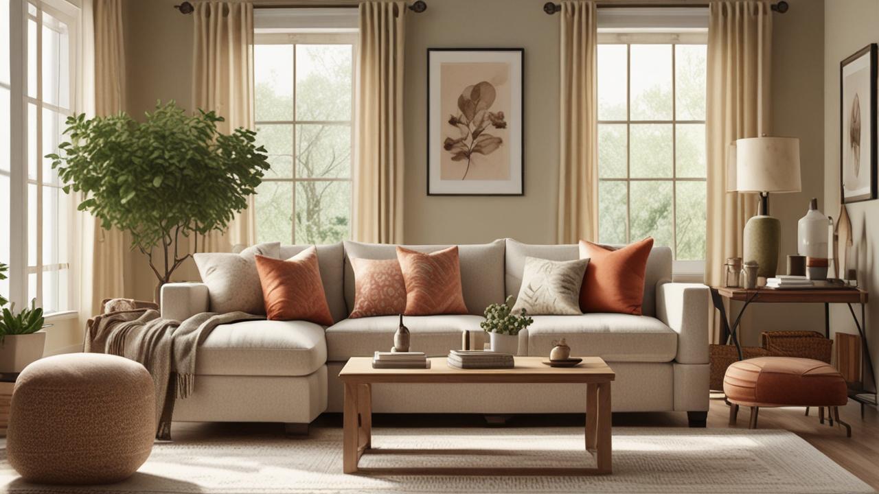
For a warm and cozy atmosphere, opt for colors like reds, oranges, yellows, and warm browns. These colors are inviting and can make a room feel more intimate and comfortable. A deep red rug can add a touch of luxury and warmth, while a golden yellow can make a space feel sunny and cheerful.
Imagine a living room with a fireplace and comfortable seating. A rug in a deep rust or a warm, earthy brown can enhance that feeling of comfort. These colors are reminiscent of natural elements, like wood and soil, which often bring a sense of grounding and warmth.
Even neutrals can be warm. Think of beige, taupe, or warm grays. These shades provide a soft, inviting backdrop.
When selecting warm neutrals, look for undertones that lean towards yellow or red, rather than blue or green.
- Inviting Ambiance: Warm colors like reds, oranges, and yellows create a welcoming feel.
- Comforting Neutrals: Beige, taupe, and warm grays also contribute to a cozy atmosphere.
- Natural Connection: Earthy tones can bring a sense of grounding and security to the room.
A family with young children might choose a plush, textured rug in a warm, muted orange for their living room. This color is cheerful and hides everyday spills well, while the texture adds to the cozy feel. The warmth of the orange makes the room feel like a place where everyone can relax and gather.
This approach ensures the living room is not just a display space but a functional and comfortable family hub.
Cool and Serene Spaces
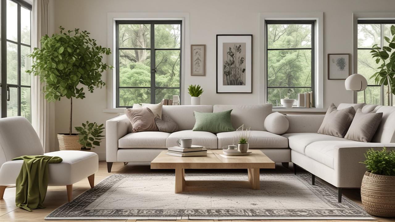
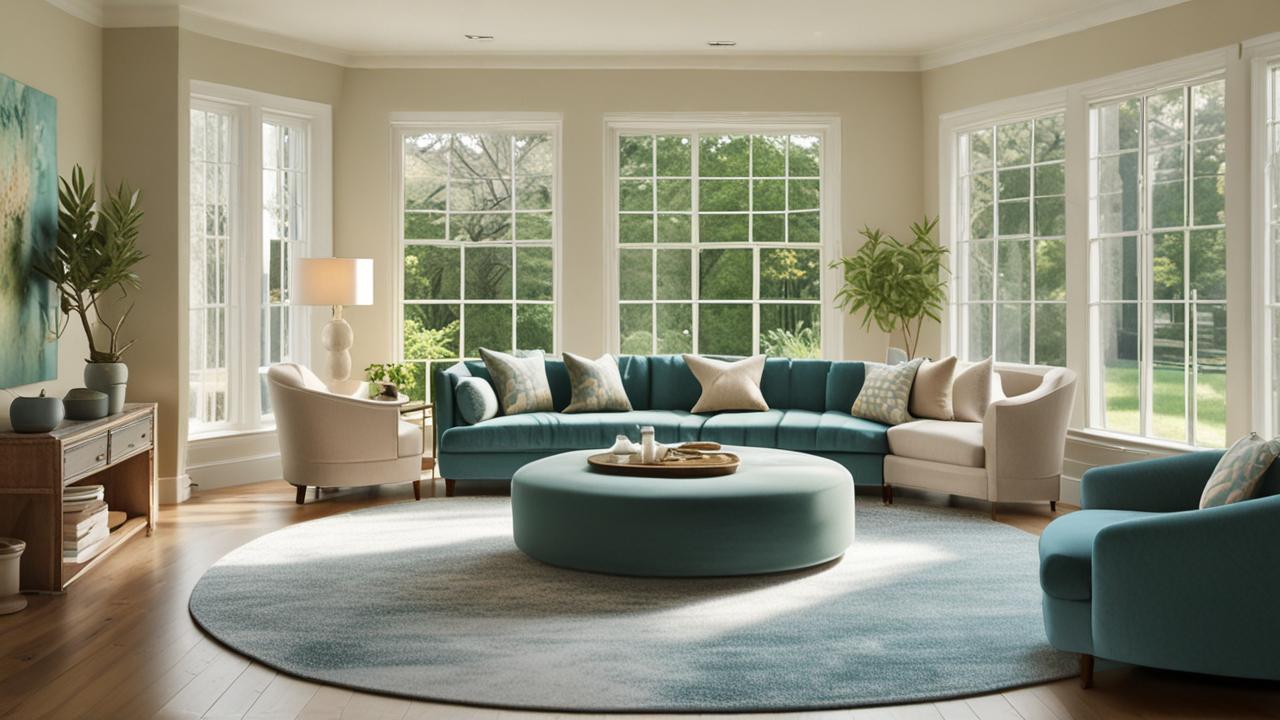
To create a cool and serene living room, blues, greens, and cool grays are excellent choices. These colors are known for their calming properties and can make a space feel more tranquil and spacious. A light blue rug can evoke the feeling of the sky or water, promoting relaxation.
If your living room gets a lot of sunlight, a cool-toned rug can help balance the warmth. A deep teal or a calming seafoam green can bring a sense of nature indoors. These colors are often associated with peace and tranquility.
Cool neutrals, like icy blues or crisp whites, can also contribute to this feel. They provide a clean and airy look. When using cool colors, consider the texture of the rug.
A smooth, low-pile rug can enhance the sleek, modern feel, while a shaggy rug in a cool tone can add softness.
- Calming Atmosphere: Blues, greens, and cool grays promote relaxation and peace.
- Airy Feel: These colors can make a room feel more open and spacious.
- Balancing Light: Cool tones can help moderate rooms that feel too warm from excessive sunlight.
Consider a home office area within a living room. To foster focus and a sense of calm, a rug in a muted sage green or a soft sky blue could be ideal. These colors are not overly stimulating, allowing for concentration.
They also complement natural wood furniture, creating a balanced, airy workspace. Many people find that simply changing their rug to a cooler tone has a noticeable effect on their stress levels in the room.
Making a Bold Statement
Sometimes, you want your rug to be the star of the show. Bold colors and strong patterns can make a powerful statement. This is perfect for rooms where you want to express your personality and create a unique focal point.
Think bright pinks, vibrant oranges, or striking geometric patterns.
A rug with a large, intricate pattern in contrasting colors can instantly elevate a simple room. It adds energy and visual interest. This is a great way to express your style and make your living room memorable.
Even a simple room with basic furniture can look amazing with a show-stopping rug.
When opting for a bold rug, it’s often best to keep the rest of your decor relatively simple. This allows the rug to shine without overwhelming the space. You can pull accent colors from the rug and use them sparingly in your pillows or artwork.
- Focal Point Creation: Bold rugs command attention and become the room’s main feature.
- Expressing Personality: This is an excellent way to showcase your individual style.
- Room Elevation: A statement rug can transform a plain room into something extraordinary.
For example, a living room with plain white walls and simple gray furniture could be transformed by a large Persian-style rug with rich jewel tones like sapphire blue, emerald green, and ruby red. The intricate pattern and vibrant colors would create an immediate sense of drama and luxury. This approach is often seen in eclectic or bohemian-style homes where individuality is celebrated.
Rug Color and Room Size
The size of your living room is a key factor when deciding on a rug color. Different colors can make a space feel larger or smaller, so it’s important to choose wisely.
Light Colors for Small Spaces
If your living room is on the smaller side, light-colored rugs are your best friend. Colors like white, cream, light gray, pale blue, or soft beige can make the room feel more open and airy. They reflect light, making the space seem larger than it is.
A light rug can help a small living room feel less crowded. It creates a sense of spaciousness and allows the room to breathe. Avoid dark, heavy colors that can make a small room feel closed in.
Think of a light rug as an optical illusion, expanding your space.
When using light colors, consider the material. A stain-resistant material is important, especially for high-traffic areas. Even though it’s light, it can still be practical.
A light, patterned rug can also add interest without making the room feel smaller, as long as the pattern isn’t too busy.
- Enlarging Effect: Light colors reflect light, making small rooms appear bigger.
- Airiness: They create a sense of openness and prevent the room from feeling cramped.
- Visual Expansion: Opt for light, neutral tones or subtle patterns in lighter shades.
Consider a compact apartment living room with limited natural light. A cream-colored shag rug would work wonders. The light color bounces light around, while the soft texture adds comfort without making the space feel visually heavy.
This choice makes the room feel more welcoming and significantly larger than its actual dimensions. Many homeowners in urban areas use this technique to maximize their living space.
Dark Colors for Large Rooms
For larger living rooms, dark colors can be very effective at making the space feel cozier and more intimate. Deep blues, rich browns, charcoal grays, or deep greens can anchor the room and prevent it from feeling too vast or empty.
A large room can sometimes feel a bit impersonal. A darker rug can add warmth and a sense of grounding. It makes the area feel more inviting and comfortable, like a snug retreat.
This is especially true if you have high ceilings or a lot of open space.
Dark colors can also be very practical. They tend to hide dirt and stains better than lighter colors, which is a bonus in any busy living room. When choosing a dark rug, think about the texture.
A plush, deep pile rug can add an extra layer of luxury and comfort to a large space.
- Creating Coziness: Dark colors can make large rooms feel more intimate and inviting.
- Anchoring the Space: They provide a sense of grounding, preventing the room from feeling cavernous.
- Practicality: Darker hues are often more forgiving when it comes to showing wear and tear.
Imagine a spacious, open-plan living area. A large, dark chocolate brown rug could define the seating area and make it feel more like a distinct, cozy zone. This contrast with lighter walls and furniture would add depth and character.
This choice turns a potentially overwhelming space into a comfortable and stylish gathering spot.
Understanding Different Color Schemes
Different color schemes can help you think about how rug colors work together. There are a few basic ways to approach color that can make choosing a rug much easier.
Monochromatic Scheme
A monochromatic scheme uses different shades and tints of a single color. For your living room, this means picking one main color and using variations of it for your rug, walls, and furniture. For example, if you love blue, you might have navy blue furniture, light blue walls, and a rug with various shades of blue in its pattern.
This approach creates a very calm and sophisticated look. It’s easy on the eyes and gives the room a unified feel. When using a monochromatic scheme, texture becomes very important.
Different textures in the same color family can add depth and prevent the room from looking flat.
A rug in a monochromatic scheme might have a slightly different shade of your main color, or it might have a subtle pattern that uses lighter and darker versions of that color. This provides visual interest without introducing a new color. It’s a very classic and timeless design choice.
- Unified Look: A monochromatic scheme creates a cohesive and harmonious space using variations of one color.
- Sophisticated Feel: This approach often results in a very elegant and understated design.
- Emphasis on Texture: When colors are similar, textures become key to adding depth and interest.
Consider a living room where the walls are a soft dove gray. The sofa is a medium gray, and the accent chairs are a lighter, almost silver-gray. A rug that features a pattern of lighter and darker grays, perhaps with a subtle sheen, would complete this monochromatic look perfectly.
This creates a serene and modern atmosphere. A designer noted that monochromatic rooms are often perceived as more peaceful, with 85% of people finding them relaxing.
Analogous Scheme
An analogous color scheme uses colors that are next to each other on the color wheel. For example, blue, blue-green, and green are analogous colors. Using these colors together creates a pleasing and harmonious look, as they naturally blend well.
If your sofa is a lovely teal, you might choose a rug that has hints of blue and green in it. This creates a natural flow and makes the room feel balanced and comfortable. It’s a bit more varied than monochromatic but still very cohesive.
This scheme is great for creating a natural and calming environment. Think of the colors you see in nature – like the blues of the sky and water, or the greens of leaves and grass. These combinations are inherently pleasing to the eye.
The rug can tie these natural colors together.
- Harmonious Blending: Analogous colors sit next to each other on the color wheel, creating natural visual harmony.
- Pleasing Combinations: This scheme offers a bit more variety than monochromatic while remaining visually restful.
- Natural Inspiration: These color combinations often evoke the feeling of natural landscapes.
Imagine a living room with walls painted a soft moss green. You have a sofa in a deep forest green and accent pillows in a muted turquoise. A rug featuring a mix of these greens and blues, perhaps with a subtle botanical pattern, would perfectly execute an analogous scheme.
This would create a serene, nature-inspired oasis. This method often results in rooms that feel very grounded and balanced.
Complementary Scheme
A complementary color scheme uses colors that are directly opposite each other on the color wheel. The most common pair is blue and orange, but others include red and green, or yellow and purple. These colors create high contrast and can make a space feel very vibrant and energetic.
If you have a navy blue sofa, an orange or rust-colored rug could create a dramatic and eye-catching look. This high contrast can make elements of your room really pop. It’s a bold choice that can add a lot of personality.
When using complementary colors, it’s often best to use one color as the dominant shade and the other as an accent. For example, you might have a mostly blue room with orange accents in the rug and pillows. This prevents the room from feeling too overwhelming.
It’s about balance and intentional use of strong colors.
- High Contrast: Complementary colors are opposite on the color wheel, creating strong visual impact.
- Vibrant Energy: This scheme can make a room feel dynamic, lively, and exciting.
- Strategic Accentuation: Often used by making one color dominant and the other an accent for balance.
Consider a living room with a bright yellow sofa. A rug with deep purple accents or a purple base with yellow patterns would create a striking complementary scheme. This combination is bold and artistic, making the living room a memorable space.
It’s ideal for someone who loves a lively and expressive home environment. This technique is often used to create a focal point.
Practical Tips for Choosing
Beyond the color theory, there are some practical things to keep in mind when you’re ready to pick your rug. These tips can help you avoid common mistakes and feel more confident in your choice.
Consider the Lighting
The lighting in your living room plays a huge role in how a rug color appears. Natural daylight can make colors look truer, while artificial lighting can cast different tones. A rug that looks perfect in the store might appear very different in your home.
If your living room has a lot of natural light, colors might appear brighter. You might be able to get away with a slightly darker or more saturated color. In a room with less natural light, lighter colors are often a better choice to help brighten the space.
When you’re looking at rugs, try to see them in lighting similar to your living room. If possible, ask for a swatch to take home. This way, you can see how the color looks in your actual space at different times of the day.
Lamps and overhead lights can also change the color. Warm-toned bulbs can make blues look more green, and cool-toned bulbs can make yellows look more orange.
- Daylight vs. Artificial Light: Colors appear differently under natural and artificial lighting conditions.
- Light Levels Matter: Rooms with less light benefit from lighter rug colors to appear brighter.
- Test at Home: Always try to see a swatch in your own home to gauge the true color.
A homeowner in a basement apartment with minimal natural light chose a pale blue rug. In the store, it looked like a standard light blue. However, in their apartment, with only yellow-toned lamps, it often appeared slightly greenish.
This highlights why testing is so important. If they had taken a swatch home, they would have seen this subtle shift before purchasing.
Think About the Style of Your Room
The overall style of your living room should guide your rug color choice. A modern living room might suit a sleek, solid-colored rug or one with geometric patterns. A more traditional room might look best with a Persian or Oriental rug with intricate designs and rich colors.
If your room has a rustic feel, natural tones like browns, beiges, and muted greens would fit well. For a bohemian style, you might opt for a more eclectic mix of colors and patterns, perhaps a colorful tribal-inspired rug.
Don’t be afraid to mix styles, but be intentional about it. The rug color can help bridge different design elements. For instance, if you have modern furniture but love a touch of vintage, a rug with a modern color palette but a slightly vintage pattern could be perfect.
- Style Alignment: Choose a rug color that complements your room’s existing aesthetic, whether modern, traditional, or rustic.
- Bridging Elements: A rug can connect different design styles within a single space.
- Pattern and Color Choices: Consider how patterns and colors align with contemporary, classic, or eclectic decor.
A homeowner was redecorating their mid-century modern living room. They had clean-lined furniture in walnut tones. Instead of a plain rug, they chose a rug with a geometric pattern in muted teal and mustard yellow.
This complemented the mid-century aesthetic while adding a unique touch of color and personality. The rug became a key piece that tied the whole room together.
Consider the Durability and Maintenance
While color is important, don’t forget about how well the rug will hold up and how easy it will be to maintain. Some colors are more forgiving than others when it comes to hiding dirt and wear.
Lighter, solid colors can show every speck of dust and every spilled drop. Darker colors, or rugs with busy patterns, tend to hide dirt and wear better. This is especially important if you have pets or children, or if your living room gets a lot of foot traffic.
The material of the rug also plays a role. Wool rugs are durable and can last for years, but they can be more expensive. Synthetic fibers like nylon or polyester are often more stain-resistant and easier to clean.
Think about how much time and effort you’re willing to put into cleaning your rug.
- Stain Hiding: Busy patterns and darker colors are generally better at concealing spills and dirt.
- Traffic Tolerance: Consider how well the color will hold up to heavy foot traffic over time.
- Material Impact: Rug material affects both durability and how easily stains can be removed.
A busy family with two dogs and two children decided on a medium-toned gray rug with an abstract pattern for their living room. This choice proved practical, as it effectively disguised pet hair and minor spills. If they had chosen a solid beige rug, the wear and tear would have been much more noticeable.
This practical consideration is vital for long-term satisfaction with your rug choice.
Rug Color Examples and Scenarios
Let’s look at some practical examples to help you visualize how different rug colors can work in various living room settings. These scenarios will illustrate the concepts we’ve discussed.
Scenario 1: The Cozy Family Room
Imagine a family living room that needs to be both comfortable for movie nights and cheerful for playtime. The walls are a neutral beige. The sofa is a comfortable, medium-gray fabric.
There are some colorful children’s toys and books scattered around.
- Goal: Create a warm, inviting, and practical space for family activities.
- Rug Choice: A medium-toned, warm-toned rug, perhaps a burnt orange or a deep rust. It should have a subtle texture or a low-pile pattern that can hide minor spills and pet hair (if applicable).
- Why it works: The warm orange tones complement the beige walls and add energy without being overwhelming. The medium tone is forgiving for everyday messes. The texture adds to the cozy feel.
A rug in a muted terracotta would be a great choice here. It provides a pop of color that makes the room feel lively and welcoming. This hue is also relatively neutral, meaning it won’t clash easily with other decor elements you might add over time.
It successfully balances the need for a family-friendly space with a desire for style.
Scenario 2: The Elegant, Adult Retreat
Picture a living room designed for relaxation and adult conversation. The walls are a soft, muted blue. The furniture includes a dark charcoal sofa and a pair of cream-colored armchairs.
The room has elegant lamps and sophisticated artwork.
- Goal: Achieve a serene, sophisticated, and cohesive atmosphere.
- Rug Choice: A rug with a neutral base, like a creamy ivory or a very light gray, with subtle patterns or accents in shades of deep blue and perhaps a touch of silver or soft gold.
- Why it works: The neutral base keeps the room feeling light and airy, complementing the cream armchairs. The deep blue accents tie into the wall color and the charcoal sofa, creating a unified, monochromatic-like feel. The sophisticated pattern adds depth without being distracting.
A rug with an intricate, damask-style pattern in varying shades of blue on an ivory background would be ideal. This adds a touch of classic elegance. It respects the cool color palette while introducing visual interest.
The overall effect is one of calm luxury and refined taste.
Frequently Asked Questions
Question: What is the easiest way to choose a rug color?
Answer: The easiest way is to pick a color that is already in your room, perhaps from your walls, sofa, or curtains. Look for a rug that has a main color matching your walls or a pattern that includes a few of your room’s existing colors.
Question: Should my rug be darker or lighter than my furniture?
Answer: It depends on the look you want. A lighter rug than dark furniture makes the furniture stand out. A darker rug than light furniture can create a grounding effect.
Often, a contrast of a few shades lighter or darker works well.
Question: Can I use a very bright rug color in a small living room?
Answer: You can, but it’s often best balanced. A bright rug can make a small room feel more lively. However, to keep it from feeling too busy, pair it with neutral walls and furniture.
Or, use a bright rug with a neutral background and a simple pattern.
Question: How do I know if a rug color will look good with my wood floors?
Answer: Most rug colors work with wood floors. Consider the tone of your wood. Warm wood tones (like oak or cherry) pair well with warm rug colors (like beige, rust, or gold).
Cool wood tones (like maple or ash) often look good with cool rug colors (like blues, grays, or greens).
Question: What if I can’t decide between two rug colors?
Answer: Try to get samples of both rugs. Place them in your living room and look at them at different times of day and under different lighting. See which one feels better and fits more harmoniously with your existing decor.
📌 Check our Pinterest Profile for more inspiration
View on PinterestSummary
Selecting the right rug color for your living room doesn’t have to be overwhelming. By considering your room’s existing colors, the mood you want to create, and your space’s size, you can make a confident choice. Start with what you have, experiment with different shades, and trust your instincts to find a rug that truly enhances your home.